Fernweh Studio
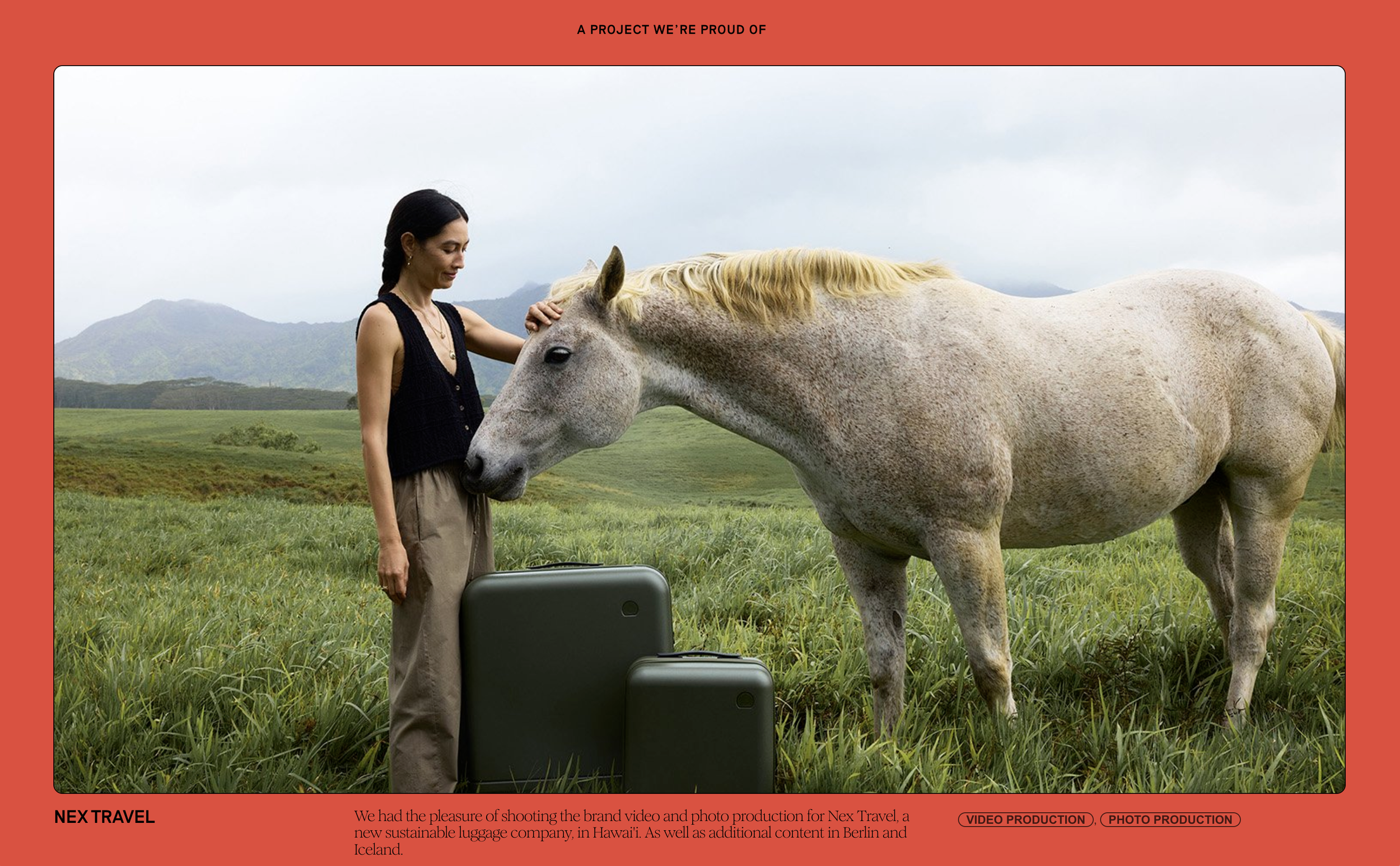
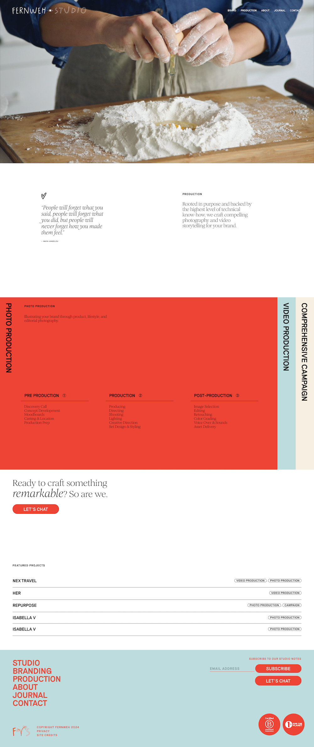
This project holds a special place in my heart. It was my first Dev Session, and designer Mindful Charlene trusted me to build this Squarespace site. Nearly every section has CSS-based structural enhancements, fully harnessing the potential of everything a well-developed Squarespace website can be.
DEV SESSION | Spring 2024
Fernweh Studio is a brand and production studio made up of a very talented duo that brings as much humor to the table as they do high production value.
Designer Charlene Timbol, of Mindful Charlene, brought me onto this project to build her playful and detail-oriented design into Squarespace 7.1. We’d taken the same design + dev classes, and spoke the same language.
It was easy for us to discuss the effects and features to be used throughout the site. She put her faith in me, and I put in the hours in the CSS window building out this high-caliber site.
Nearly every section of every page has some sort of customization. It’s the kind of development that I strive for, as the effects don’t distract from the crispy layouts and simple features designed by Charlene.
I am attracted to projects that challenge me. This project not only challenged me, it made me a MUCH better developer during this DEV SESSION.
Feature Spotlight
Inline Text GIF Section
Visitors don’t even have to scroll to find the first development gem on Fernweh Studio’s website.
This inline text GIF effect is so clean and fun, it serves as an introduction like no other. And, don’t worry, it’s responsive AF, too.
Shout out to Rache at Standout Squarespace for the code snippet starting point.
This is a summary block that has been restructured using CSS.
DEV SESSION | Spring 2024
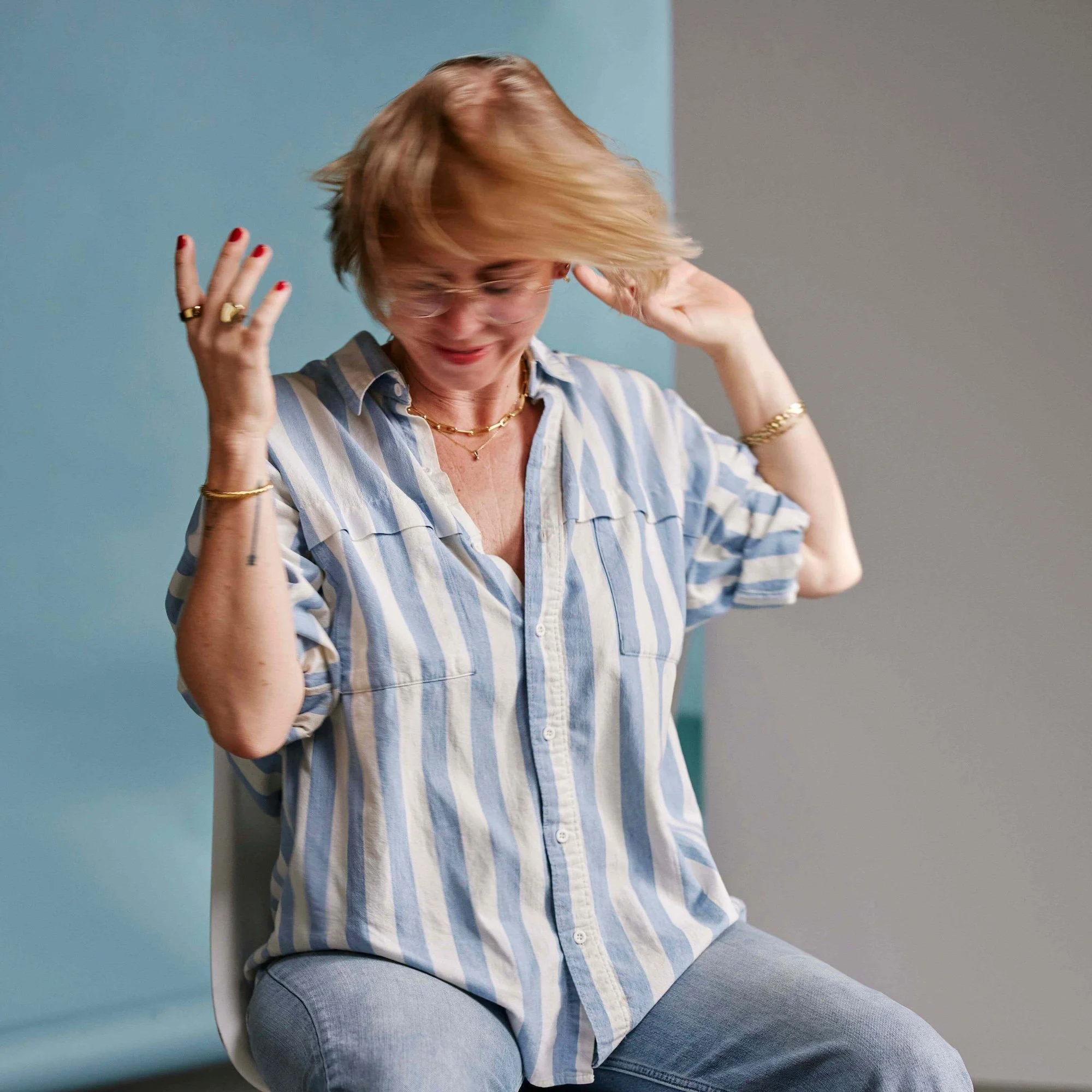
Meet Charlene Timbol
Charlene is kind with a powerhouse design eye. Her brand, Mindful Charlene is all about intentional & strategic design for purposeful yet ~fun~ brands
Feature Spotlight
Vertical Tabs Feature
Just when you thought summary blocks could only do so much - this vertical tabs feature breathes a whole new universe into this built-in Squarespace feature.
Thanks to Rache at Standout Squarespace for giving me the jumping off point for this interactive, responsive effect that stands out on any site.
Mockup v. Website
The collaboration of Dev Sessions are based on the designer’s mockups. Take a look at the relationship between developer and designer through this mockup and website comparison.
Website
Mockup
Charlene of Mindful Charlene
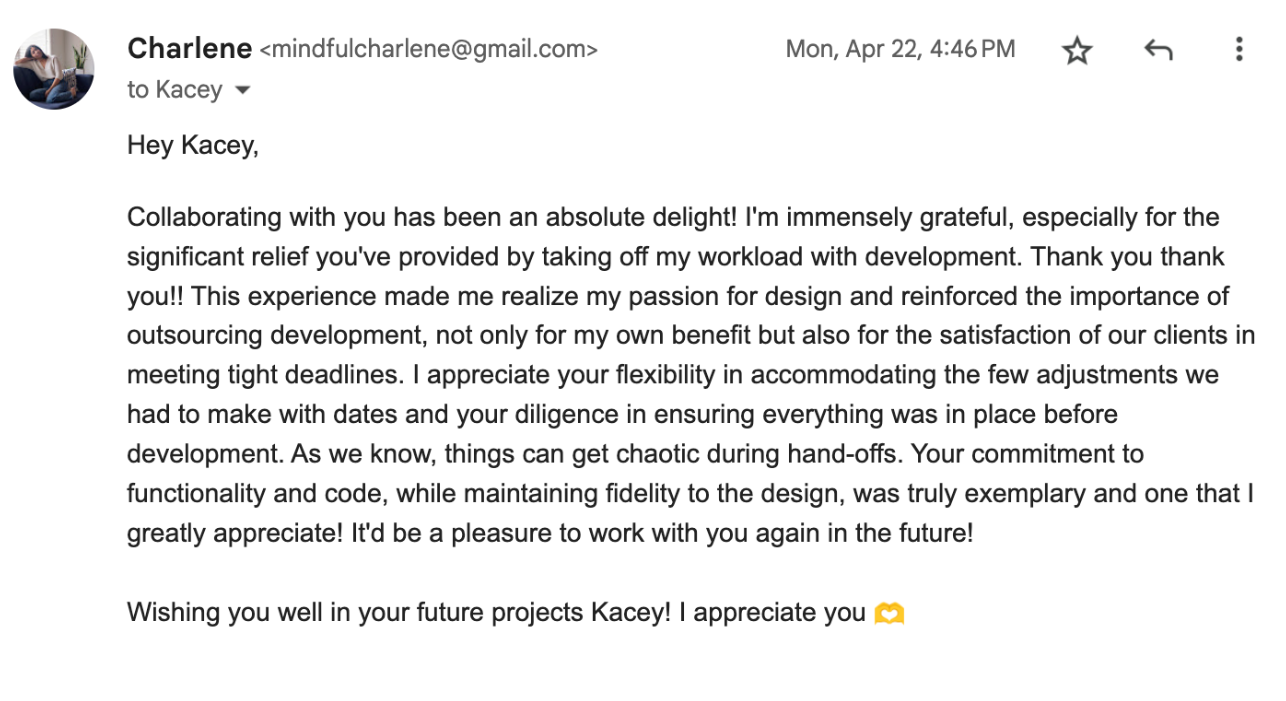
“You've been a huge help for me in this process, so I wanted to share the live site with you. There was a heavy amount of coding in this — realized when we were in the weeds with it, so appreciate the work you've done in this project!. I can’t wait to work with you in the future!”
Feature Spotlight
Horizontal Sticky Scroll
This simple horizontal scroll section is so effective, that it’s one of the most requested features for Squarespace designers.
What’s cool is that Squarespace’s built-in list section makes this pretty simple Javascript effect easy for anyone to update.
Credit for the base code goes to Rache at Squarestylist, but the tinkering and customization is all me.
Now Booking
DEV SESSIONS
Now Booking DEV SESSIONS
You don’t need another person to manage, you need a developer who takes care of you (and your client.)

